Leo & Ale — Honoring generations of family through a handcrafted brand identity
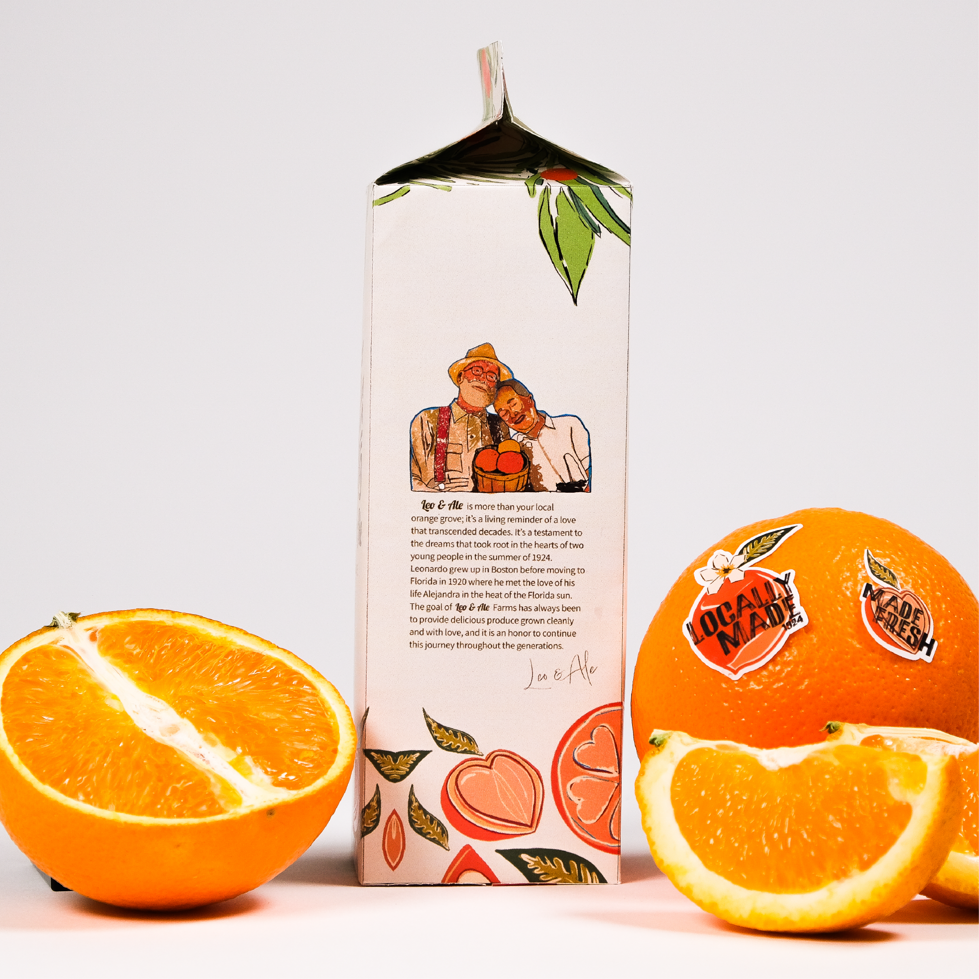
Leo & Ale is a brand identity and packaging project inspired by a local, generationally owned orange farm. The farm was originally founded by the current owner’s great-grandparents, Leonardo and Alejandra, the farm’s story became the heart of the visual identity for Leo & Ale.
The visual direction celebrates the care, tradition, and personal connection passed down through family, turning their history into a brand that feels warm, handcrafted, and deeply personal.
Year
2025
Scope
Brand Identity
Illustration
Packaging
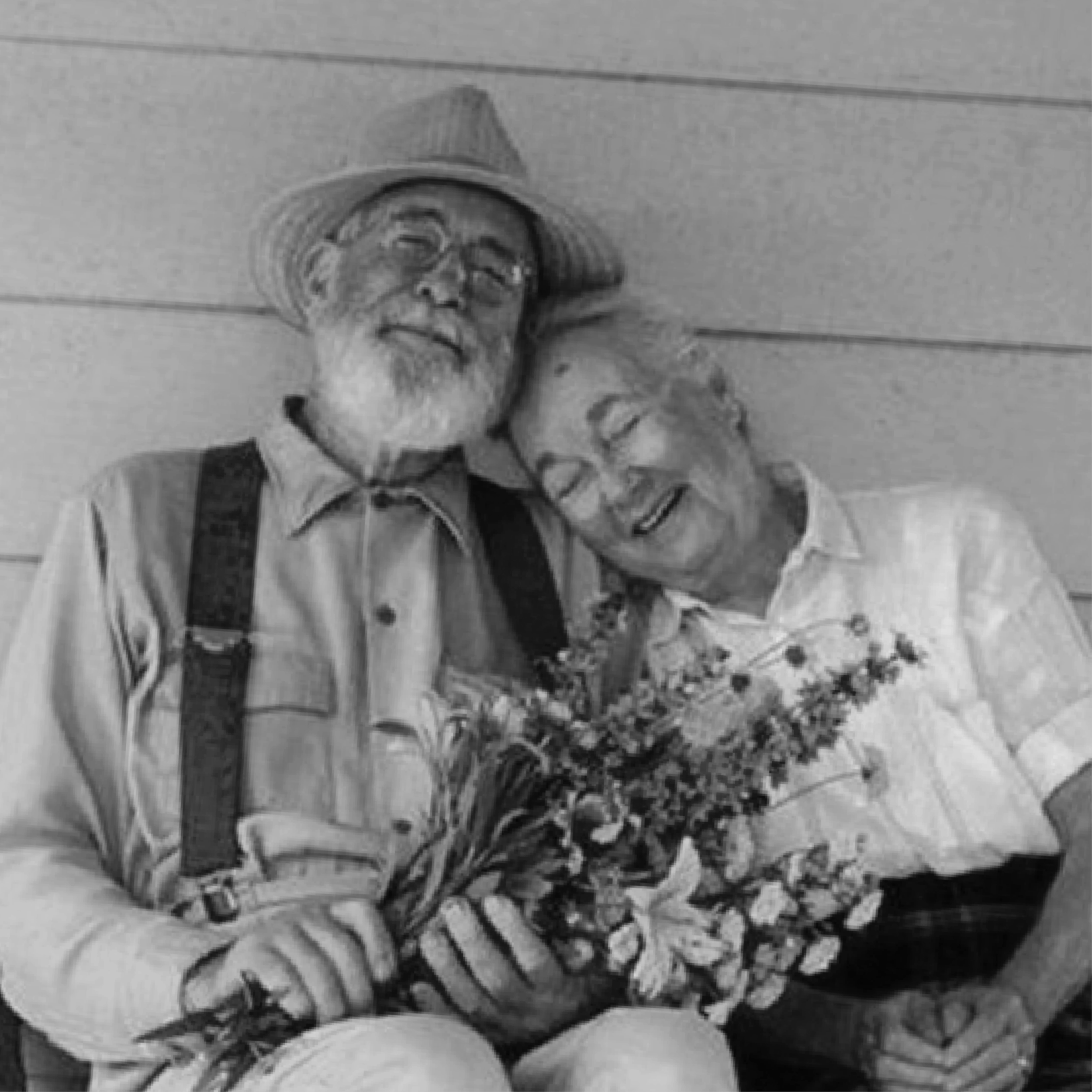
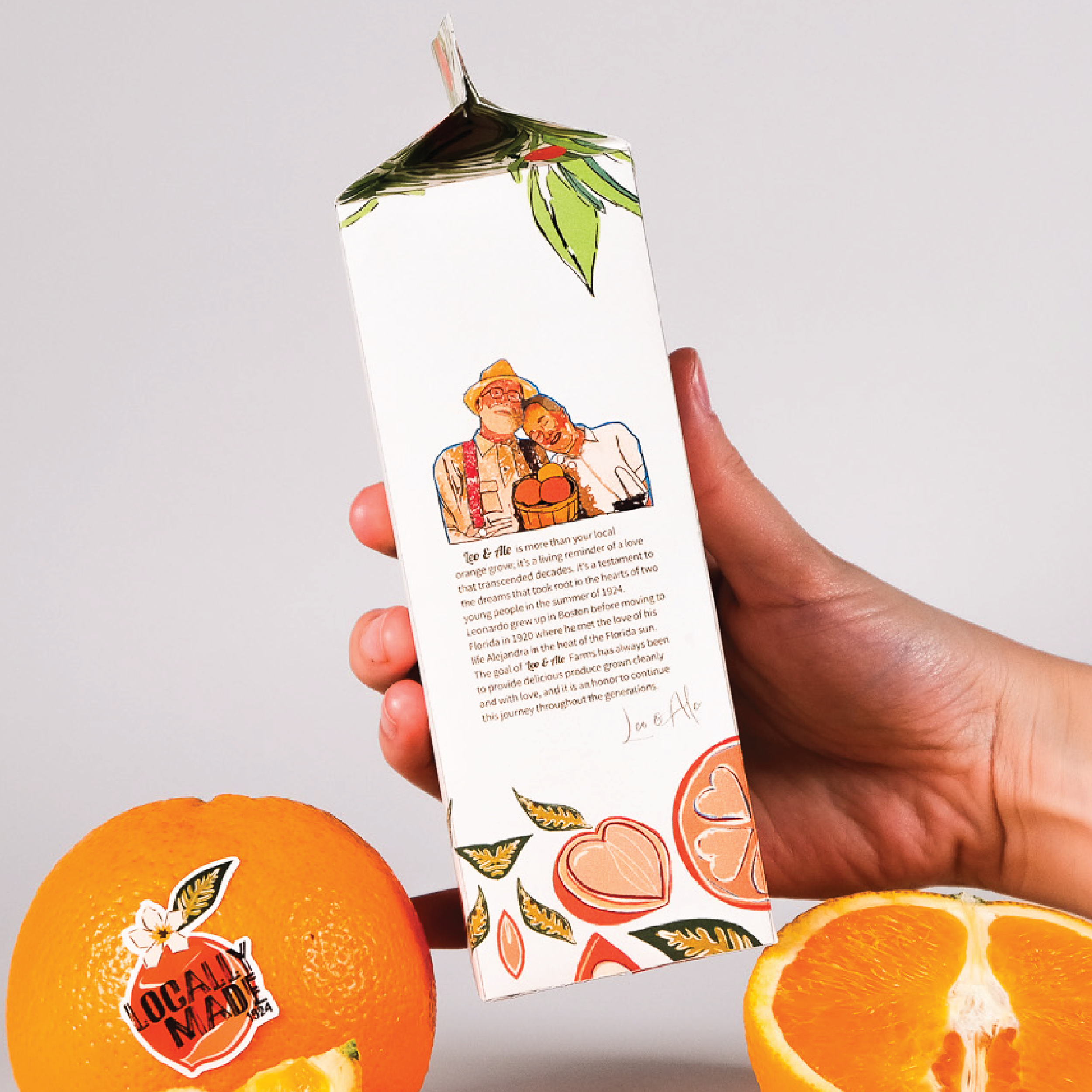
For me, Leonardo and Alejandra are the most important aspect of this brand. I wanted the people behind the farm to remain visible within the brand itself. I prioritized putting them and their story onto the packaging, to make the audience connect further to their story.
Rooted in Family
Made with Love
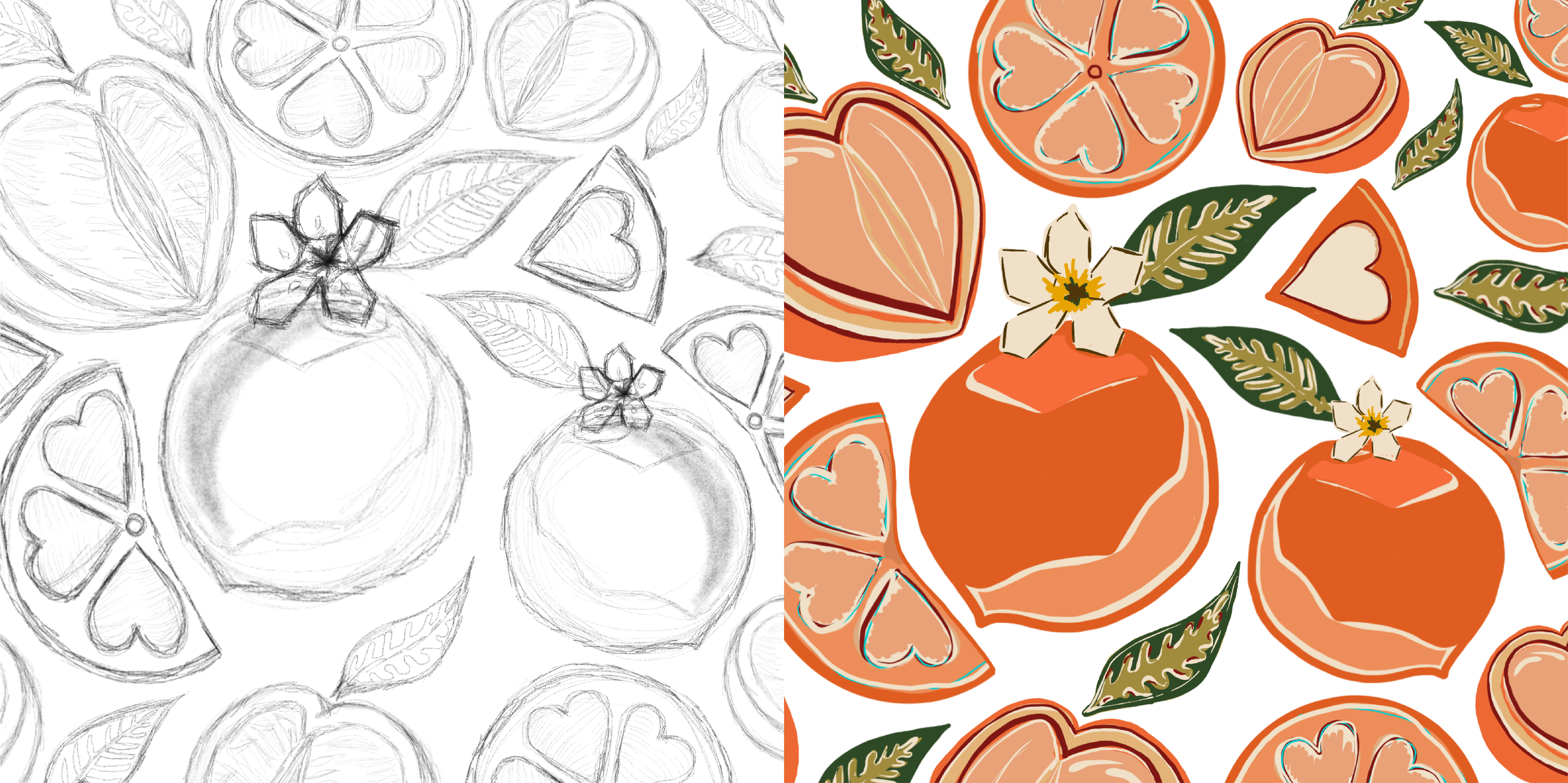
The illustration grew from one simple idea: using the farm’s oranges and making them into heart shaped forms. Drawn by hand, the pattern brings warmth into the identity.
The Logo
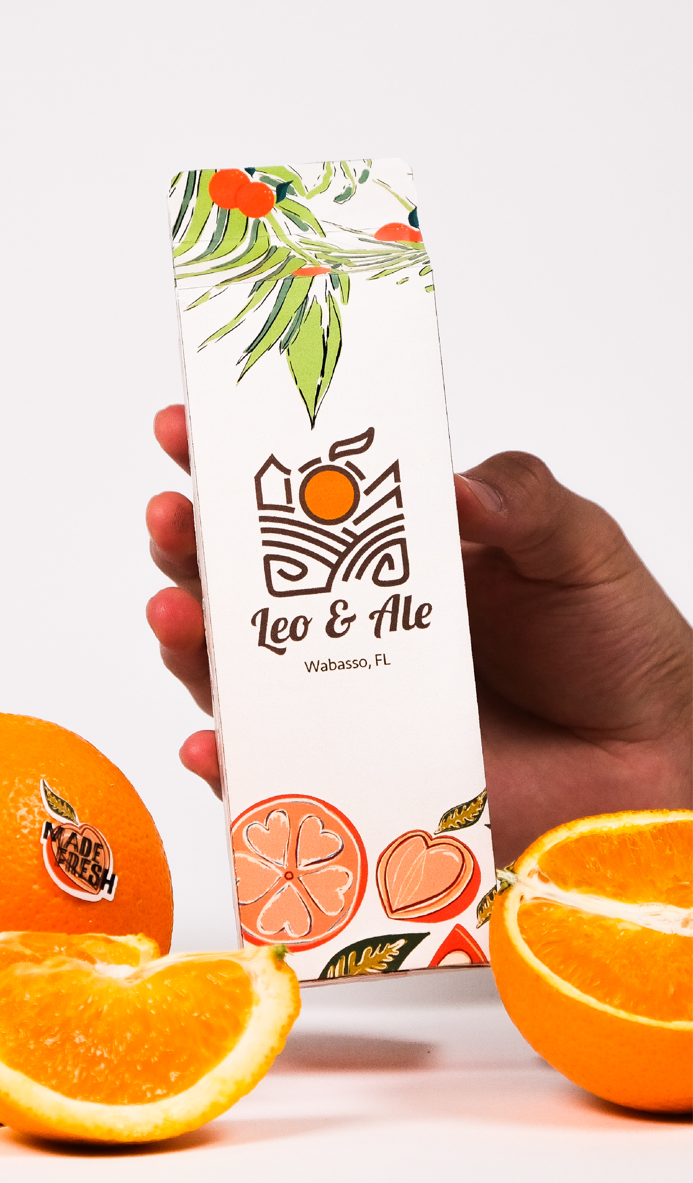
The logo for Leo & Ale was inspired by the shape of the farm and family lines, with an orange placed in the center.

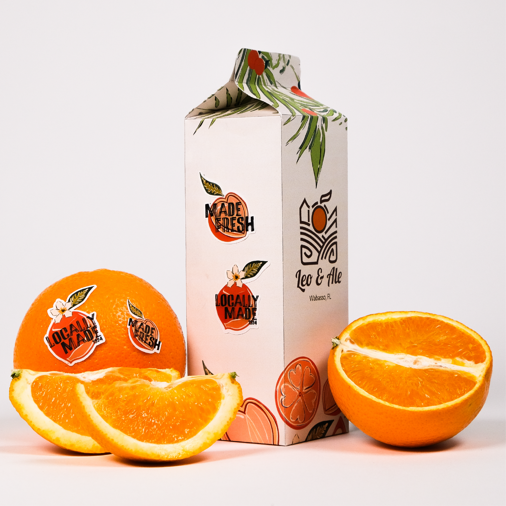
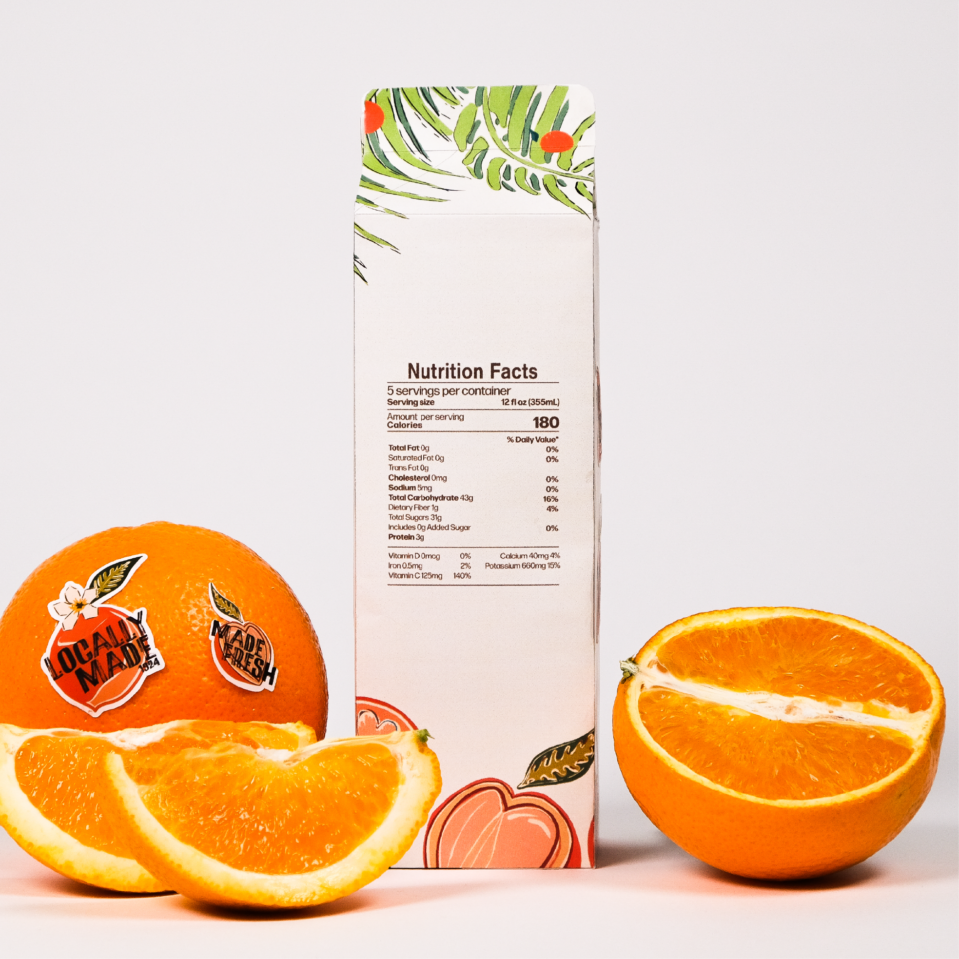
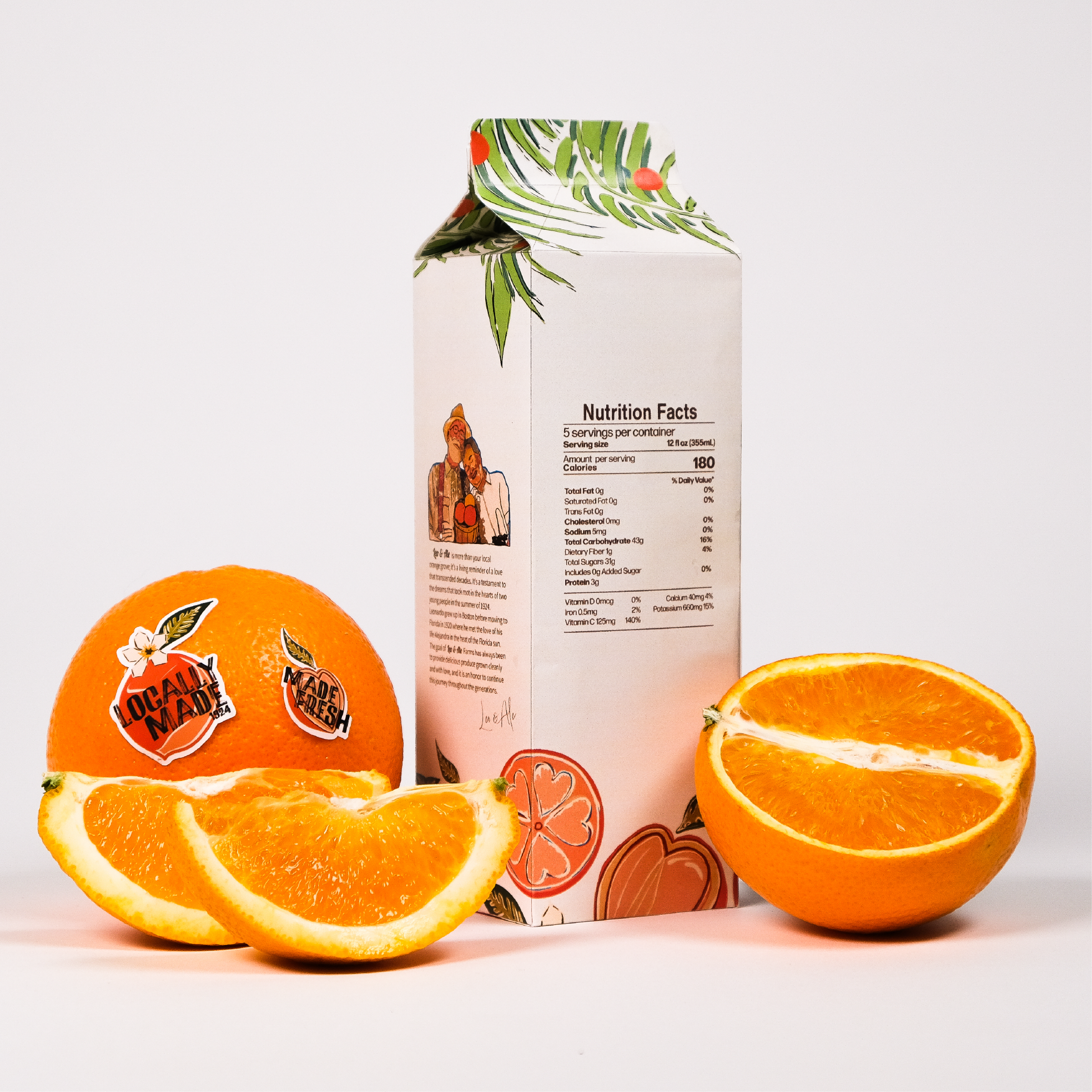
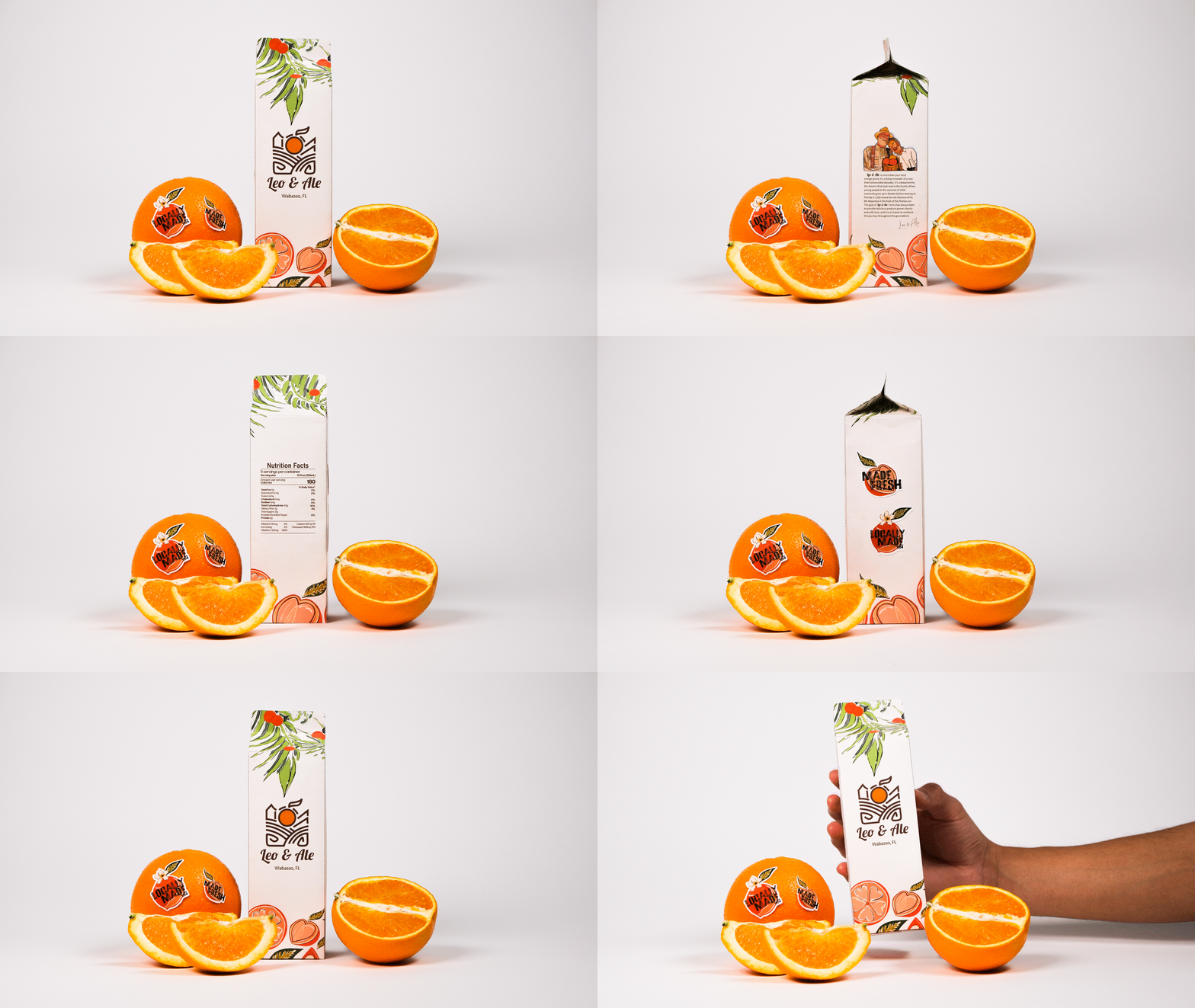
The Final Packaging
The finished identity brings Leo & Ale’s history into a visual identity that feels personal, playful, and rooted. The packaging is a celebration of Leo & Ale and the legacy they grew.